95% Adoption Doesn't Mean 95% of the Hazards
A safety observation platform can hit near-universal login and submission rates while the highest-risk tasks in the building go unobserved, because usage and hazard-capture are different metrics and only one of them makes a tidy slide.
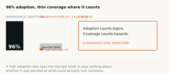
Pull up the quarterly EHS software review and the top-line number is always the same shape: adoption. Ninety-six percent of the workforce logged in this quarter. Four thousand observations submitted, up 12% year over year. A leaderboard of the ten site champions who filed the most cards. It is a good-looking slide. It is also, on its own, unable to tell you a single thing about whether anyone observed the task that was actually going to hurt someone.
That gap, between “the tool got used” and “the tool caught what mattered,” is the whole story with observation and behavior-based-safety (BBS) software. Adoption is a participation metric. It counts people. Hazard capture is a coverage metric. It has to be weighted by risk, and weighting by risk is harder to automate, harder to summarize, and much less flattering to report up the chain. So the industry reports the one it has.
Two different questions wearing one dashboard
“Did people use the system” and “did the system catch the hazards that matter” are not proxies for each other. A worker can log in daily, submit an observation every shift, and still be filing cards on the same low-friction, low-consequence behaviors, hard hat on, walkway clear, because those are the easiest things to see and the fastest to close out. Meanwhile the task that actually carries the incident risk (a confined-space entry done three times a year, a contractor crew running an unfamiliar lockout sequence, a rushed line-break at the end of a shift) never gets an observer standing next to it, because it is rare, awkward to approach, and not on anyone’s daily walking route.
OSHA’s Recommended Practices for Safety and Health Programs is explicit that leading indicators split into quantitative and qualitative, and that “level of worker participation in program activities” is one indicator among many, not a stand-in for the quality of what participation produced. The agency’s own list separates “number of hazards, near misses, and first aid cases reported” from measures of whether hazard control was actually verified and closed out. Participation counts and hazard-quality counts sit on the same page because OSHA expects programs to track both. Most vendor dashboards report only the first.
The National Safety Council’s Campbell Institute ran into this directly. In multi-year research on leading indicators, one participating manufacturer initially tracked safety training hours as its leading indicator, then found the number stopped predicting anything. Workers were completing hours; injuries were not moving. The organization eventually shifted to testing what workers retained from training months later, because attendance had turned out to be a participation metric wearing a quality metric’s clothes. Observation-submission counts are exposed to the identical failure mode: the number can plateau at a healthy level while its predictive value quietly goes to zero.
Monday-morning check
Pull last quarter's observation log and sort it by task type rather than by observer or site. Compare the task mix against your own risk register or job hazard analysis rankings. If routine, low-severity tasks dominate the log and your highest-severity, lowest-frequency tasks (confined space, energized work, crane picks, contractor-unfamiliar procedures) are thin or absent, **is your 95% adoption number measuring safety, or measuring how easy the app is to use on an easy day?**
The incentive runs the wrong direction
Peer-reviewed BBS literature has flagged this mechanism for years under a different name: quota pressure. Research on observation-process design in the Journal of Organizational Behavior Management distinguishes voluntary observation processes, where employees choose targets and see the resulting safety improvement, from mandatory “required observations” processes, where the implied consequence for skipping a card turns the exercise into an obligation. Under quota pressure, the finding is blunt: the program becomes a paperwork exercise that produces very little of the value it was built to generate. A required-observation count that management can point to at the next safety meeting is not the same thing as a program that is finding what will actually hurt someone, and treating the count as the outcome is exactly the incentive structure that produces the gap.
This is also why raw observation volume has never been a great predictor by itself. Fred Manuele’s widely cited re-examination of Heinrich’s accident ratio, published in Professional Safety, found that driving down the frequency of minor events does not reliably drive down the rate of major ones, and that the underlying source data connecting minor counts to severe outcomes was never verifiable in the first place. If minor-event volume was never a dependable signal for serious-injury risk, then a login-rate or submission-count dashboard, which is one further step removed from severity, is an even weaker one.
What coverage would actually require
None of this argues for scrapping observation programs; it argues for measuring a different thing alongside the easy thing. ANSI/ASSP Z10 frames hazard management as identify, assess risk, then apply the hierarchy of controls, elimination and substitution first, PPE last. A program that wants its observation data to serve that hierarchy needs to know not just how many cards came in, but whether the highest-consequence tasks on the risk register generated proportionate coverage, whether observations against those tasks led to control changes higher up the hierarchy than “reminded worker to wear PPE,” and whether the rate of observation on rare, high-severity tasks is rising or still near zero.
That is a harder metric to build than a login counter, because it requires tagging observations against a task-level risk register and auditing the mix, not just the total. It will never look as clean on a board slide as “96% adoption.” But a platform that can show its observation mix skewing toward the tasks that could actually kill someone is demonstrating something a participation number cannot: that the tool is being pointed at the risk, not just at the workforce.
The honest reframe for any EHS director staring at a vendor’s adoption slide is simple. Adoption tells you the tool is in people’s hands. It does not tell you where they are pointing it.